Visualizing Quantitative Information
This guide is available as a Word document or PDF.
Tables Versus Graphs
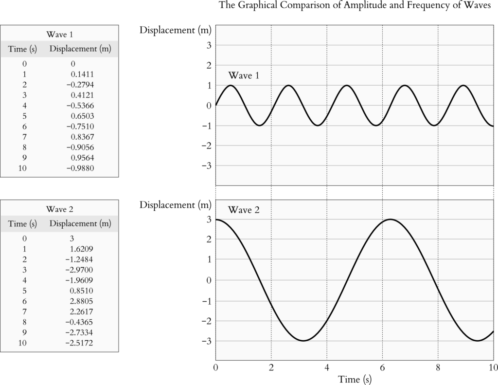
Numerical data are commonly presented as tables or graphs (Ainsworth, 2021). Tables have the additional advantage of including non-numerical data, as exemplified in Table 1. A typical reason to display numerical data on a table is so that students can extract these values to perform calculations. Moreover, interactive tables on electronic platforms allow the viewer to sort the table entries in ascending or descending order according to the data in a column of choice. The sorted dataset ranks the entries and facilitates comparisons.
| City | Area (km2) | Median salary ($/year) | Major industry |
| Springfield | 41.10 | 29 000 | Beer |
| Shelbyville | 30.68 | 25 000 | Turnips |
| Pallet | 14.40 | 3 000 | Gaming |
| Elwood | 6.11 | 57 000 | Educational media |
| Sim | 30.00 | 50 000 | Educational media |
| Folk | 0.10 | 40 000 | Gaming |
| Arlen | 25.45 | 30 000 | Propane |
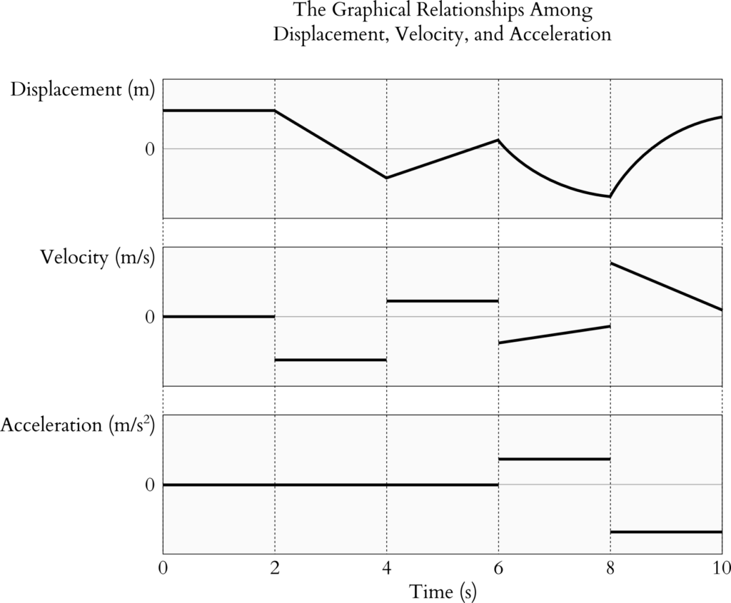
While tables are suitable for reading off specific data points, the overall trend of the data may be obscure (Figure 1). Instead, plotting the data on a graph could render the overall shape of the data more apparent, such as the slope (Figure 2), maximum and minimum points, and periodic nature (Ainsworth, 2021).
It may seem that, by convention, discrete data is displayed on a table and continuous data is shown on a graph. However, this is not always the case. In a news report about the mathematical aptitude of Canadian high school students, the math scores, which are discrete data, are plotted on a graph in order to show the decline in math scores as a downward sloping trend (CBC News: The National, 2023). Moreover, the probabilities of continuous statistical distributions are listed in tables so that students can use these values in calculations. Thus, whether to display numerical data on a table or a graph is dependent on the message that is communicated through the data and how students will work with the data.
Other Ways of Quantitative Data Visualization
There are many other ways of representing quantitative information, such as Venn diagrams, pie charts, and discipline-specific data visualization techniques. Venn diagrams illustrate the similarities and differences, whether quantitative or qualitative, of two or three categories (Figure 3). Pie charts show the relative quantification of distinct groups within a whole (Figure 4). Among the various representations, choose those that best fit the instructional messages and learning objectives.


Media Attributions
Unless otherwise noted, all figures were created by Jung-Lynn Jonathan Yang under a CC BY-NC-ND 4.0 license.
Summary
- Typically, graphs are useful for displaying the overall shape of the data, while tables list the values of specific data points.
- Choosing a method to present numerical data depends on the subject matter.